United Utilities “Fight The Fatberg”
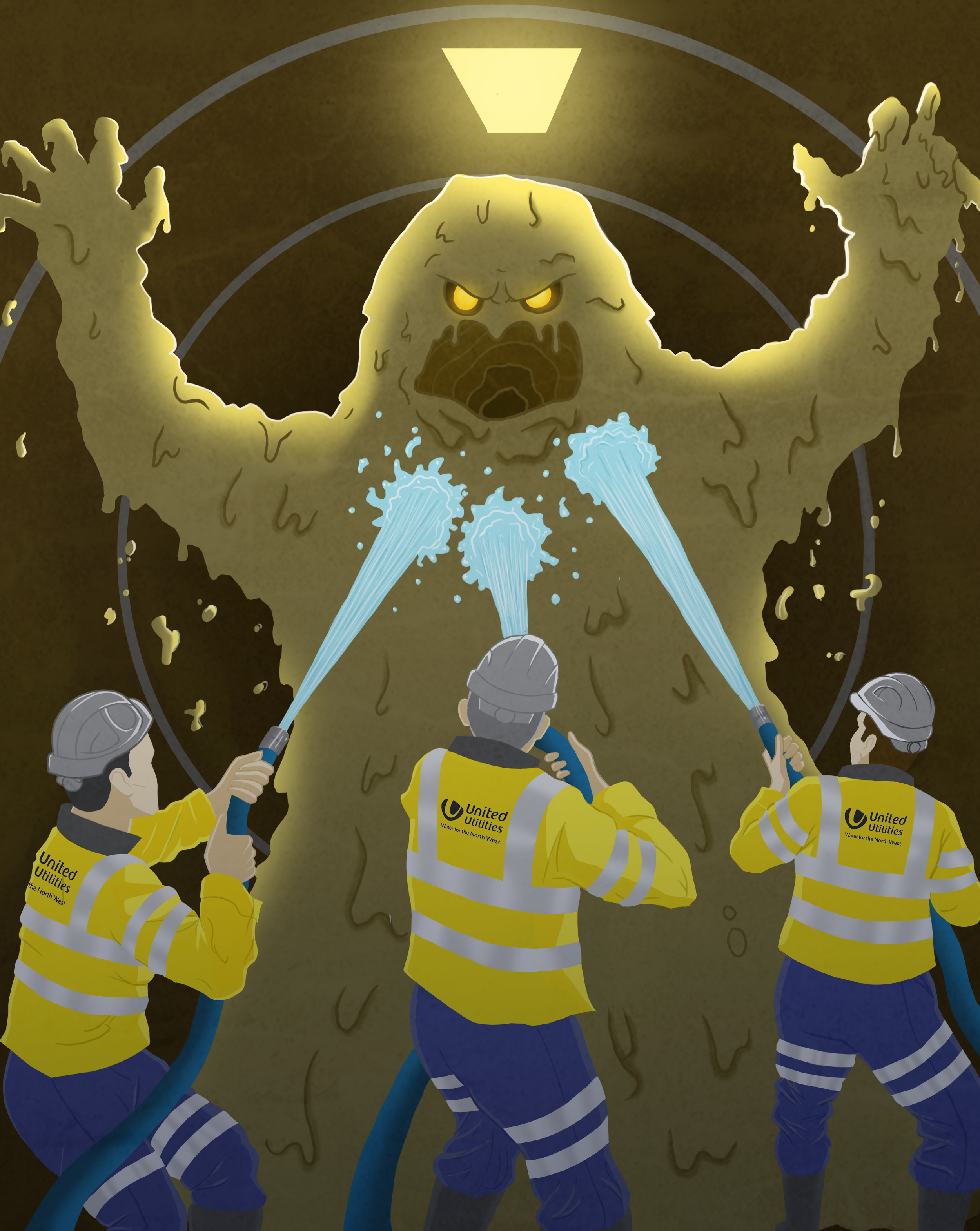
During the final year of my studies, the university offered an opportunity to work collaboratively with United Utilities on a current internal branding campaign. The primary focus of the project was to raise awareness of ‘fatberg’ causation among corporate employees. Due to the compartmentalised nature of the work, United Utilities office staff had proven to be considerably less informed on the issue of fatbergs than the sewer workers. It was of concern to the company that against all efforts working to the contrary, the office building could be contributing to the drainage problems it aims to resolve. Considering the main causes of the issue and the nature of the utilisation of an office building, it was clear the major contributing behaviour would be taking place in the bathrooms rather than through cooking practices. For this reason, I chose to focus my campaign on creating easily recognisable, educational additions to the staff toilets. By extension of the improved work-time habits, I hoped to create an impression that transcended the office space and ultimately made brand ambassadors of the employees outside of work.
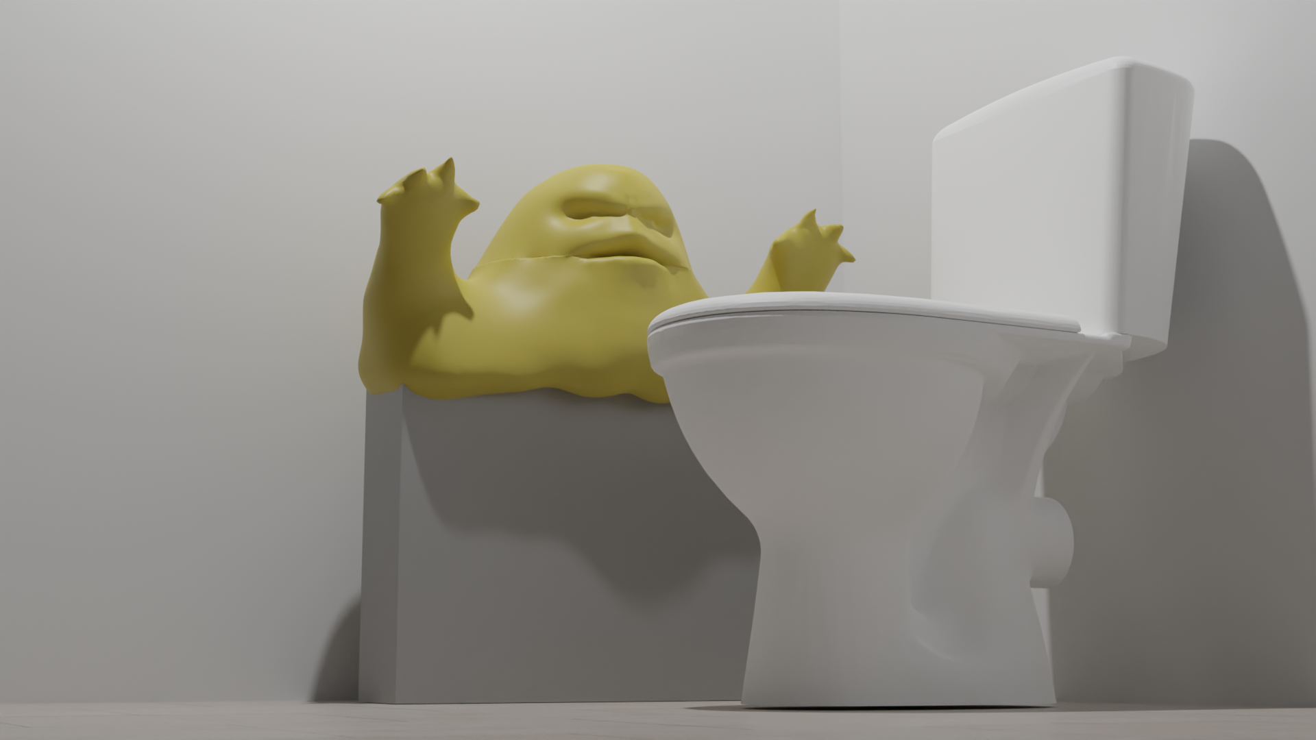
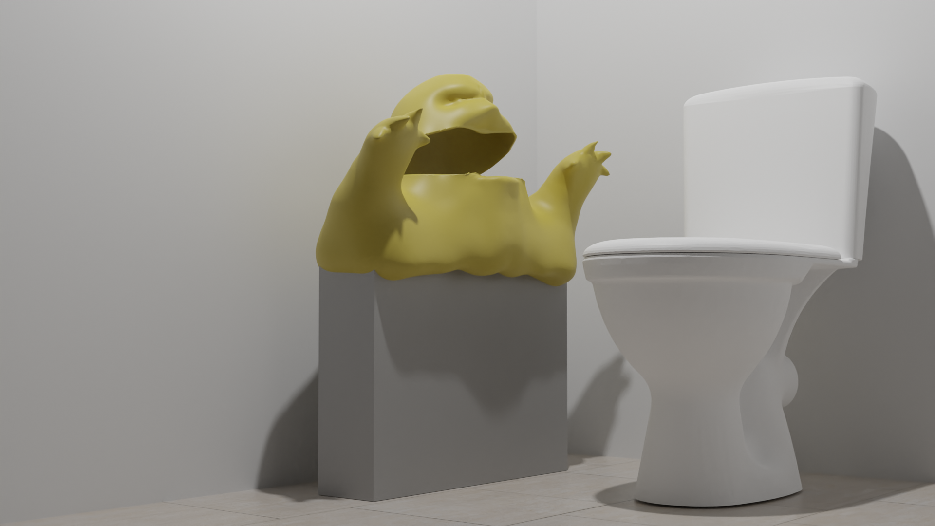
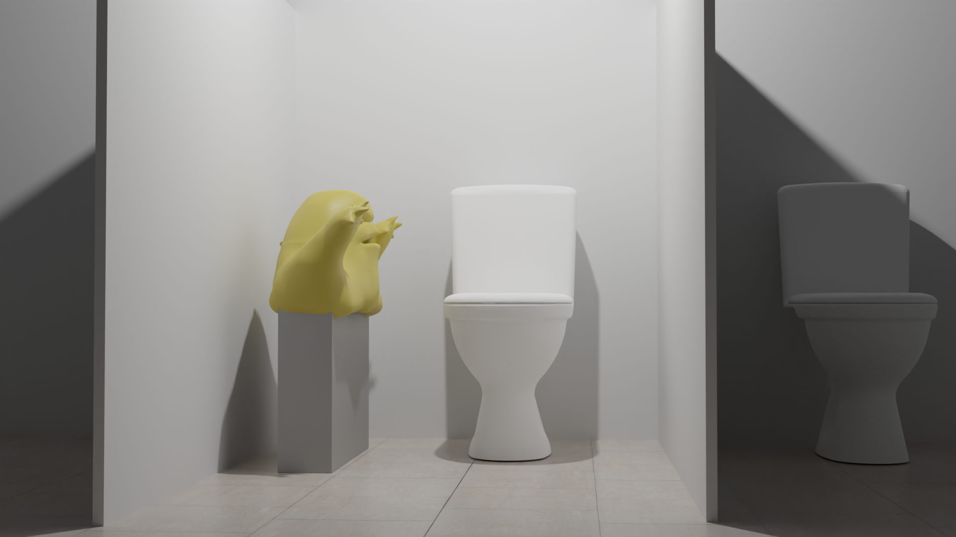
To make the issue more accessible to those without prior reference or understanding of fatbergs, it seemed appropriate to utilise tactful personification in my design. By translating the inanimate concern into an immersive narrative and detestable character, the context of the issue can be inferred in a single image rather than relying on the unlikely event of viewers voluntarily reading a heavy body of text on their break. The slogan ‘Fight the Fatberg!’ was also used to help unify the viewer with the depicted ‘hero’ in the illustration. During the development process of this idea, I decided to incorporate pop culture references to maximise information retention. I consciously selected references with the advantage of associative song and ultimately settled on the idea of ‘70s/80s film’ for a consistent visual theme. By updating viewers perception of popular media such as Ghostbusters’ ‘Who you gonna call?’ and the famous musical number ‘Grease Lighting’ the ads make otherwise uninteresting information entertaining and memorable. In the event that a simple wall poster should be overlooked, I also resolved to create branded sanitary bins, toilet stickers and toilet paper. I contacted various manufacturers, including Essity, to price the production of the complete campaign.
The inspiration behind this photo comes from the name grease, as fatbergs are formed from oils and fats that are flushed down the toilet. United utilities told us that Fatbergs attract a lot of rats as they like to burrow in them, so for this poster I also wanted to illustrate one of the negative side effects to fatbergs that people will be disgusted by. The interesting thing about this poster is that I'm showing a disgusting site in an humorous light, so I'm not telling the audience that its bad that fatbergs cause fatbergs, I'm letting them come to that conclusion based on how they feel after looking at the poster.


